Featured

Stolen Painting and the Woes of the World

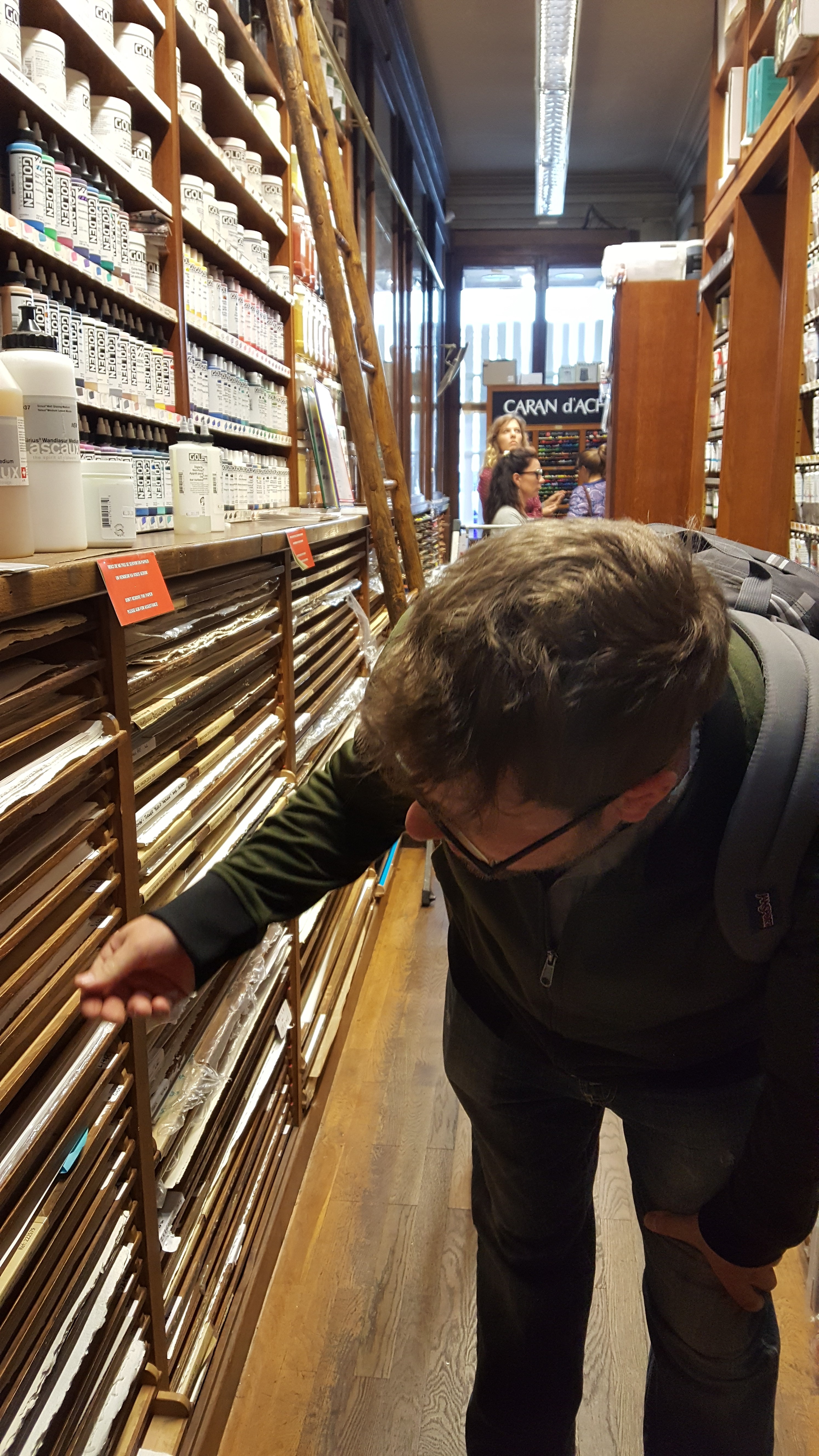
My last public exhibit would have been fantastic; I sold 4 pieces out of it and was thrilled that folks were loving my work! Yes it, was better than most of the showings even, but for one horrible event: someone stole a painting.

I remember the morning I received a call from the curator and coordinator of the exhibit at the local county developmental services building. I couldn’t believe what I was hearing; She informed me that my painting is missing and we’ve very little info about when and how it was taken. She had put in an information request for the video that day. She said that she believed the police were already involved, but would let me know developments as she became aware.

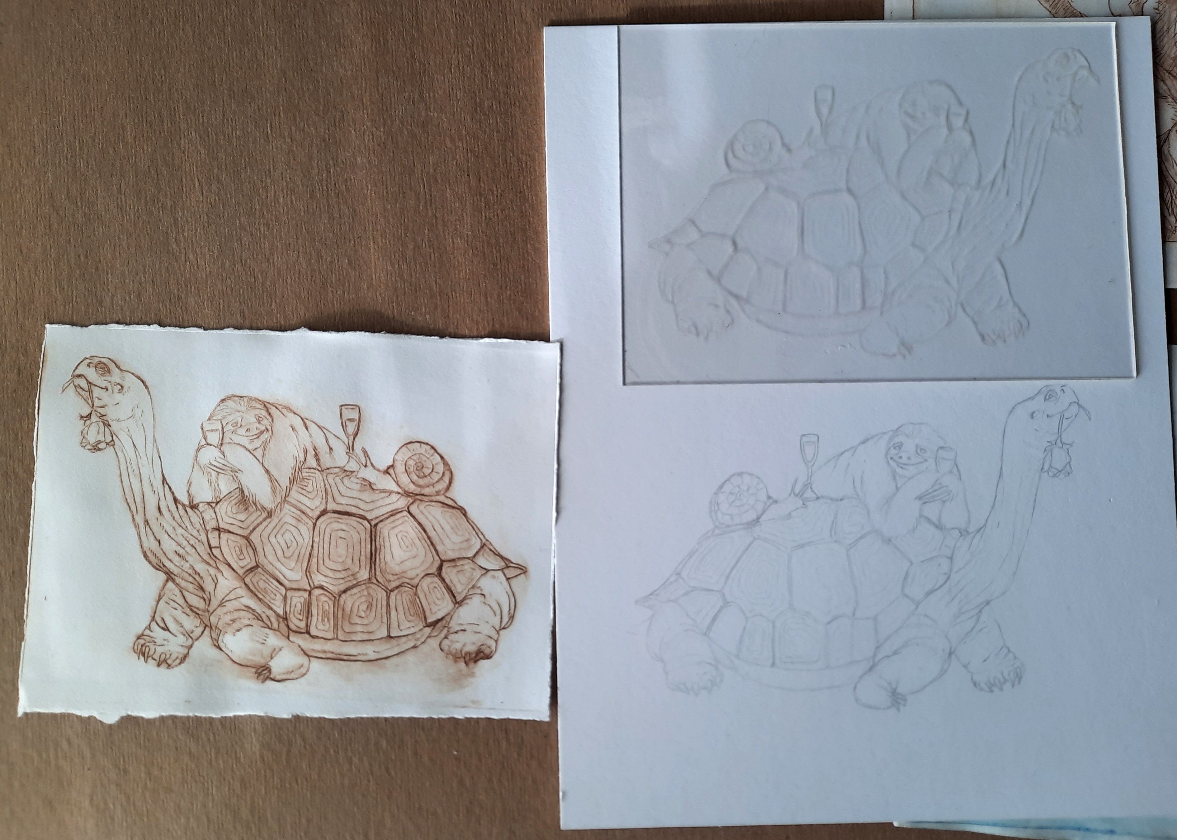
I was gutted. This painting was special to me- I’d viewed it as an avatar of sorts: a silly octopus trying to juggle as many art forms as it could manage- a camera, a carving knife, a brush, a potter’s wheel… And- I had already sold it. It was required to hang on the wall until the exhibit ended, but it was paid for and purchased. I decided to wait to let the owner know, hoping it would be found. After all, how could someone steal a painting on the 4th floor of a government building that you are supposed to sign in to, with cameras everywhere, and employees always present and not get caught?

When I finally heard that the video request turned up nothing because the county had no idea when it was taken, although they were informed of a narrow window of possibility, I had to let the owner know. When I asked what the police had to say, I was informed that they were never involved. They had never called them. If an item is stolen from your building, would you not inform the police? I was furious, but kept it cool and it immediately called them to report the theft. When a responding police officer responded, he let me know that there was little they could do now because the county didn’t put a hold on the surveillance video and instead recorded over it. Suspicious, I thought. When collecting the exhibit, I was also informed that in order to remove the piece from the hanging system, the thief would have had to be standing on a chair or ladder, none of which were in the area except in a locked employee lounge. What was I to think? What would you think?

Facing all of this, I offered the patron a refund, but she graciously offered that instead of a refund we could do a commissioned piece. Another octopus, but this time playing on the beach. No refund, but a new painting- A ‘washout’, if you will. So, that is what I titled the piece; The Washout. I have to say, I like it more than the original Artopus.

I carried insurance to hopefully cover the theft, but they wouldn’t reimburse the price of the stolen work- only the cost of the materials used to create it, providing I could give them receipts. That was ridiculous to me, because it was purchased and had passed the line of perceived value and into the land of real value. They disagreed. So, I don’t see much value in their services now.

As for the county and all the absolute devastating incompetence I encountered through tangentially dealing with them, I’m lost at what could be done. My wife is an employee there (in a different department) and I would hate for it to cause problems for her. In spite of it all, I would and have shown with the group who coordinated the exhibit. I believe that they were led to believe certain things in the beginning that led to a worse outcome. Ultimately, I’m disappointed in whomever decided my work was good enough to steal, but not good enough to buy. I can forgive your interruption to my merry art-making, but I do hope your eyeballs fall out and you can never gaze on anything except the blackness of your soul.

Featured

Book Release!!

I’ve released two books aimed at different ages or levels of children. I had a lot of fun illustrating these and even more fun writing them! I love linguistic ballet of rhymes! My daughter designed the font, which makes it our first official collaboration. One day, she’ll be writing these stories!

The first is titled ‘Taking it Slow and Other Fun Rhymes‘. This book is intended for a younger crowd and is packed with short rhyming stories and limericks that will be sure to make your kiddos and yourself laugh until the couch is wet. Here’s a few examples from the book-

The second book in the series is titled ‘The Long Shot and Other Important Stories’ and is a beautiful collection of stories and images that are sure to make you laugh, cry, and maybe even view the world in a different way. A third book is on the way and should be available before Christmas of 2023!

A few demos from my latest series. Part 1: Koo Koo.

Ah, the good old days! Back when eating copious amounts of sugared cereal wasn’t frowned upon; before the internet made up words like ‘obesity’ and ‘diabetes ‘. 😋

We sure love the absurd connection of various animals to our favorite crunchy pleasures! Today’s feature: the cuckoo bird. Specifically, the Guira Cuckoo.

Part 1: The drawing on primed and toned canvas. I use a carbon pencil to get my drawing down. I usually seal the drawing in with a toned clear gesso.

Part 2: Begin working up the dead layers. My approach varies depending g on how adventurous I’m feeling and what specifically the painting might call for, but this is typically the next step.

Part 3: Continued toning in the ‘dead layer’. How can the layer that brings so much life to the painting be called such a thing? It should be called the ‘living layer’! Umber tones help bring the values forward. Later, when blues are glazed over the umber, they produce different tones of black.

Part 4: Flesh tones. Using cadmium reds, zinc white, cad. Orange, yellow ochre, and a pinch of ivory black, I mix a scale of flesh tones.

Part 5: Main figures. Sometimes, it might be appropriate to work from the background forward. On pieces like this, where the background is a grounding, nondescript plane, I work front to back.

Part 6: Details and glazing. Opaque details and shadow glazing, as well as deepening flesh tones with red and yellow glazes. Background blacks are built up with ultramarine glazes. Finally, highlights are distributed where needed.

If you’ve enjoyed this wee tutorial, or have questions, please let me know! Cheers!

Messing around with sanguine Part 3

After a few months of trying the Zecchi sanguine chunks, I am not really impressed with the quality of product I got- not in terms of quality of drawing stone, but more in terms of quality of intensity and shade of red. They’re simply too light for me. I understand that many artists may prefer a lighter line to build layering on, but for me- even on darker paper it lacks the quality I was expecting.

20171009_154615

I purchased my lump sanguine at the Senellier art supply shop in Paris back in October of 2017. It really wasn’t easy to find in the shop among all of the other wonderful traditional tools and materials, but there it was, high upon a shelf near the pastels. They had, at the time, two varieties of Zecchi lumps, both packaged differently. After speaking with a salesman, I was convinced that both products were the same. I decided to go with the bagged product because I was travelling and it seemed to contain more viable material. The price for either product was about 13 Euro. After buying rolls of their Ingres pastel paper, I went back to the apartment to try out my stash. I immediately, I could tell these were not of the same quality as the no longer available Cenini lumps I bought years ago. I decided I would give them more of a shot when I got back home and had more time to experiment. They feel the same when drawing, but no matter how hard I press or how many layered lines I put down, the light orange is all they give me. after pulverizing a few and adding some iron oxide pigment, I was able to make drawing sticks that I could work with. The consistency is preferable when used this way and you can also make a variety of shades depending on your mixture ratio. If anyone can tell me where I can buy sanguine lumps of better quality , I would be grateful. I’ve spent loads of time scouring the web, coming up with broken links, or outrageous prices for an unfamiliar product. Also, if anyone has input about a possibility that the product I bought from Senellier is not typical, please let me know! I’m also hunting for a great traditional natural white chalk to use. Any info would be a great help!

20180204_162316

The Zecchi brand and the marks it makes in comparison to the Cennini brand on the right.

20180204_162359

chimp1-22-18

A few drawings make with a combination of the mixed Zecchi and iron oxide.

Quinn1-25-18

New Children’s Books are published!

Both are now available in paperback!
https://www.amazon.com/gp/aw/d/B0C87SCZPS/ref=tmm_pap_swatch_0?ie=UTF8&qid=&sr=
https://www.amazon.com/gp/aw/d/B0C87VKZV7/ref=tmm_pap_swatch_0?ie=UTF8&qid=&sr=

I’ve been working on these in tandem throughout the last few years and have finally organized the stories into two separate books! Each book has 16 different illustrations with stories or poems. I hope you all love them!

Long Shot

A new piece. Part of a parody series.

Sometimes doing research for a painting can be a bit dull, but for this series, I had a blast! I have quite a few more planned, so lots of toons to watch! Prints are available in my shop.

Long Shot Watercolor 11×14.
Running Down the Dream Watercolor 11×14

Many times, when I do a project, I don’t post images of information about it. This project is special and I’d like to spread the word. Below are some of the illustrations I created for this book.

Time to make pasta…er… Prints!

Last February, we had a massive ice storm crush through our region. Our power was out for eight straight days. We had no heat, no hot water, and no practical way to cook. The house dipped to 50 degrees F during the daytime.

I was cold, tired from the crashing sounds of falling trees during the night, and anxious. Mostly, I became restless.

I remembered that I had an old pasta roller somewhere in the studio that I’d been saving for the right time. I’d read that, in a pinch, a pasta room could be made into a printing press. Could it be true? I loved etching copperplate in college, but hadn’t done it since. This was the time to try. I rounded up some paper, measured the width of the feed into the roller, and tore my paper to about 5×7 inch pieces. What to use as a plate? I’d also read that acrylic,plexi, or any stiff plastic could be etched with a sharp stylus. Using a mechanical pencil modified to hold a sewing needle, I cut plastic into shape and started to work. I draw quite a lot when planning paintings and have small moleskine sketch books filled with material. I simply laid the plastic sheets over the drawings and traced my work. The lids from old spinach containers became a favorite material of mine. It would hold a mark well. Using a piece of rough sandpaper, I was able to achieve what I hoped would be a toning effect, like aquatint. Here’s some early examples using water soluble oil paint as ink.

After the roller failed and the storm was over, I bought a cheap table top press online. Now I print to my heart’s content, bigger and cleaner prints with proper ink. I used water proof ink that I could paint over.

Have you experimented with alternative printing methods? I’d love to see what others get up to when restless!